Creative Kitchen Remodel
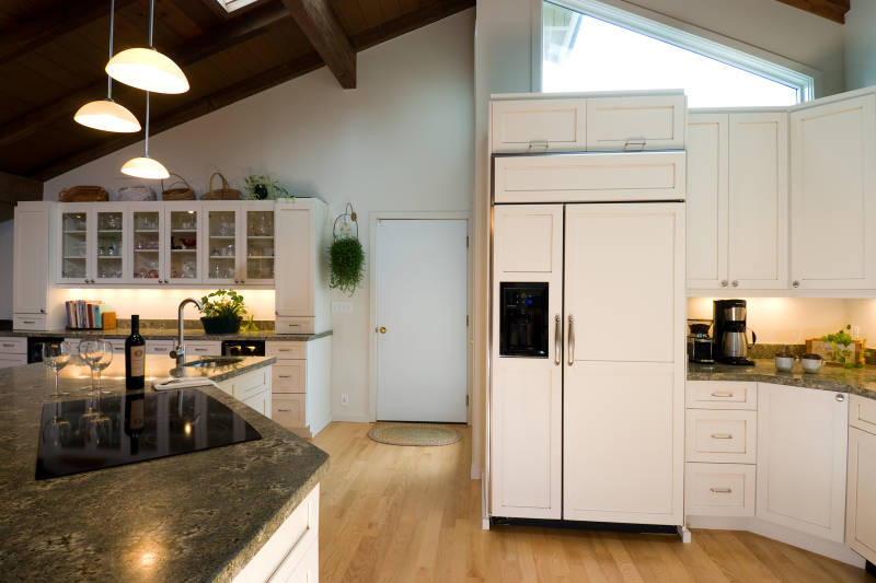
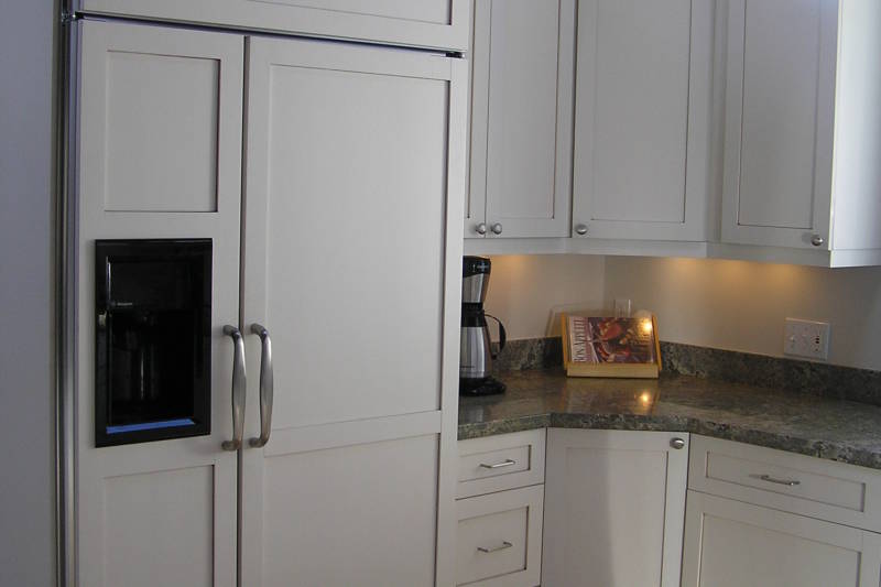
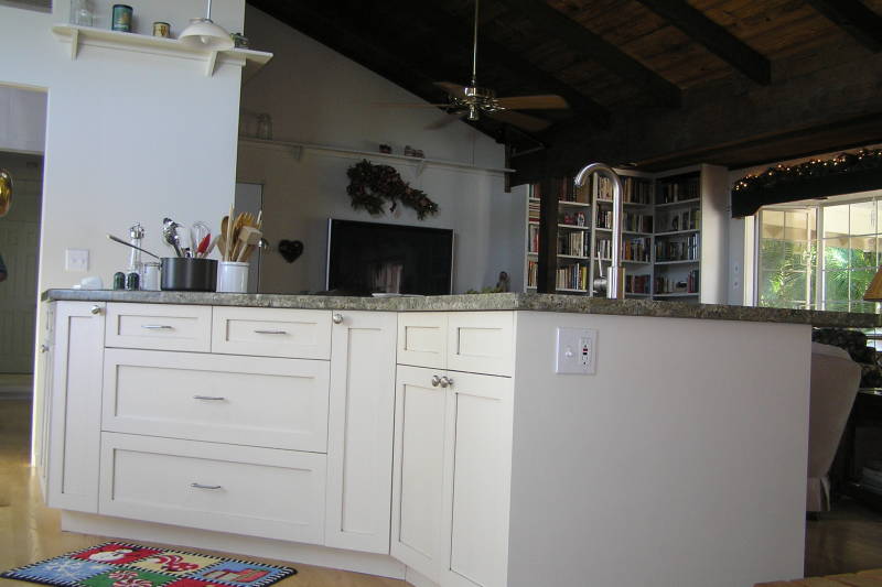
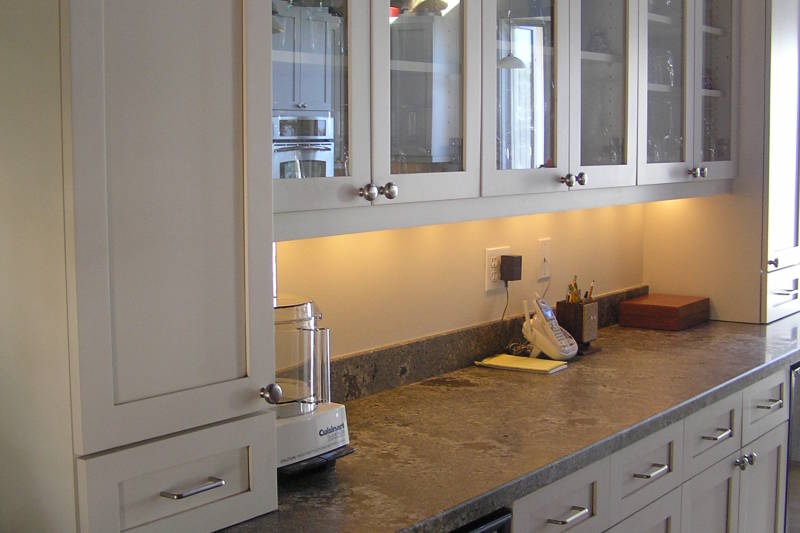
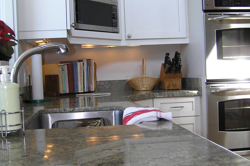
Take a deeper look into this Creative Kitchen Remodel that added space and function to the property! Built in 1975 this home underwent several additions and remodels and unfortunately for the new owner, none were to the kitchen.
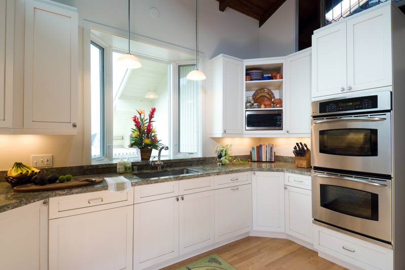
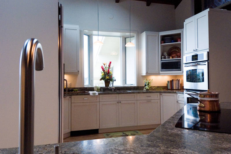
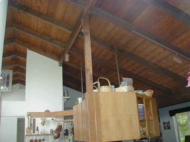
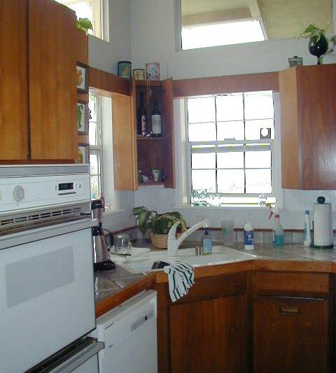
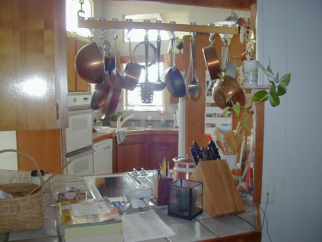
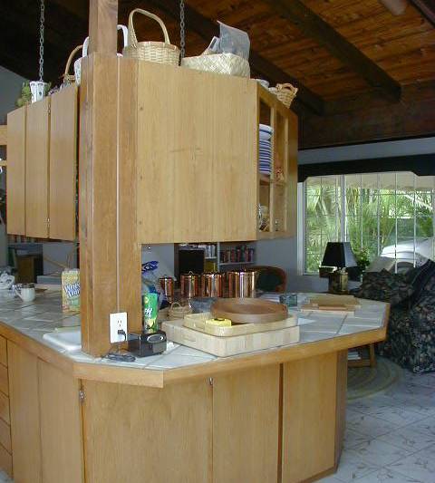
The original Kitchen presented many problems. For one, the working area near the sink was far too narrow, allowing only one person to occupy at a time. The dishwasher was so awkwardly fit into the layout that it had to be closed just to stand the sink. During parties and entertaining the pots and pans hung down over the peninsula and completely obstructed anyone in the kitchen from any type of outward conversation. A lack of upper cabinetry made access to everyday use of items like glasses and dishes very cumbersome. The peninsula only gave access to the kitchen from an odd angle and a long walk. This Kitchen was not just small, but it also fell short in functionality. The dark cabinets absorbed any light creating dark dreary environment that was uncomfortable for most. A beautiful view stood right outside the kitchen at a 45 degree angle but with the existing window placement being poor you could only catch a small glimpse of what it really had to offer. This was one major point of emphasis that needed to be corrected. The adjoining living room was also dreary and dimly lit.
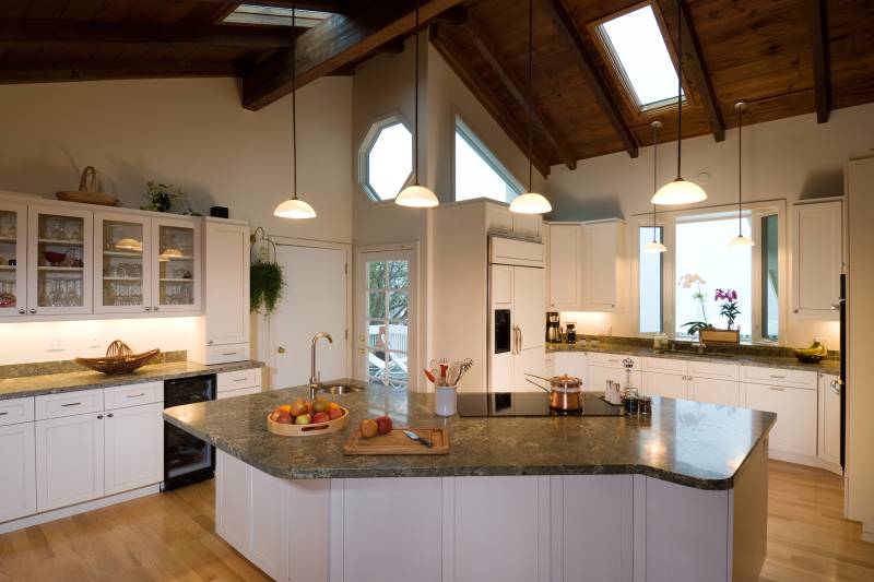
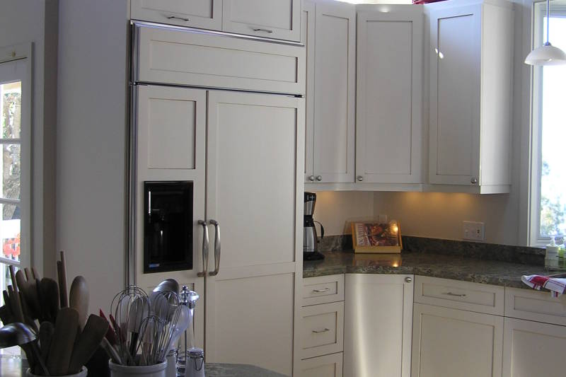
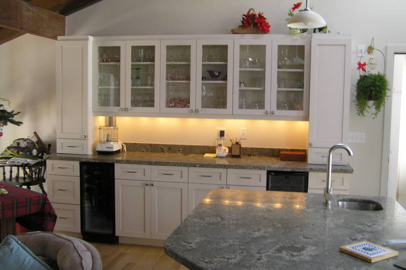
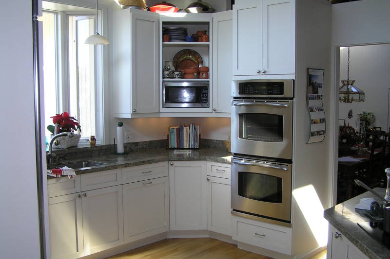
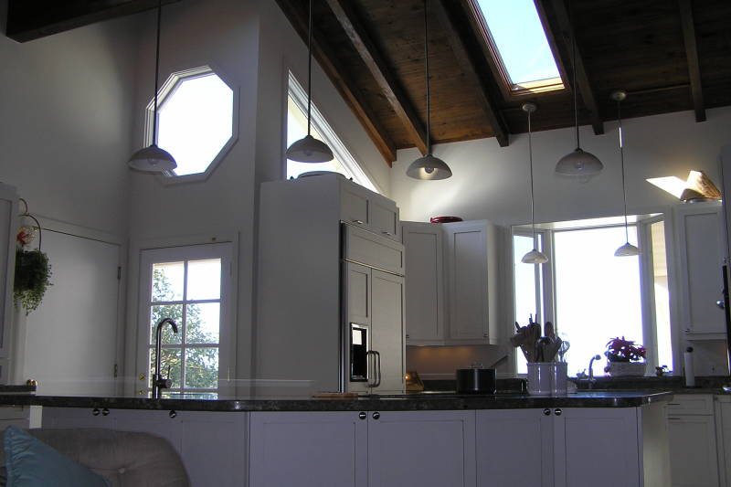
The goals were to create a functional Kitchen, a place to story everything away, add light and ambiance to the entire room, add two wine fridges, replace all the flooring and capture the view.
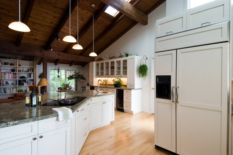
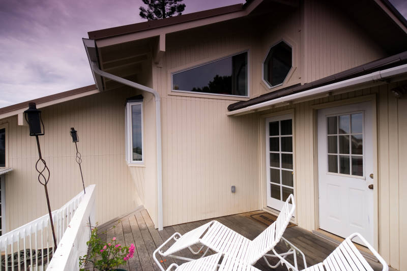
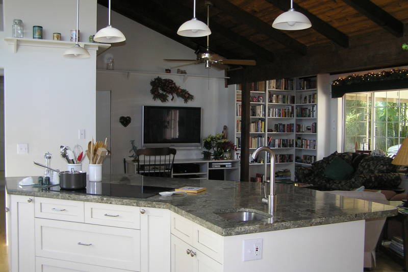
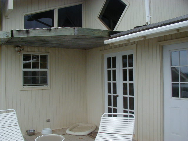
This was a complex kitchen design. Originally the goal was to build within the existing footprint but create a more functional layout. After several designs it was determined that the only resource was to extend the kitchen out onto the lanai. The main concern was that the ceiling was grooved cedar. A past patch job due to a fire was very evident and out goal was to avoid any tell tale signs of a remodel or addition. The solution was to remove the ceiling from the outside porte cochere and reuse it in the kitchen as it was the exact same material that they wanted. We dry walled the carport ceiling and added a row of canned lights. The drywall was painted white, which helped brighten up the front room during the day with ambient light that was previously absorbed by the dark ceiling but now reflected into the room.
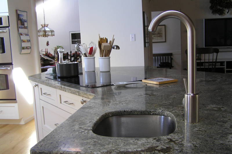
This kitchen had such a dramatic transformation it it hard to even see the original floor plan anymore. Using reclaimed material and creative solutions to create a renewed use of the space with minimal impact on the home’s footprint.
